Queen of the Neighborhood (QUOTN) is a Berlin-based platform that connects ethical shoppers, dreamers, and doers with women-owned, sustainable local businesses. As the platform continued to grow and gain recognition, the team wanted to evolve their brand identity and website to reflect their global vision while staying true to their feminist roots.
QUOTN
COMPLETION
August 2019
DURATION
8 weeks
Website Designer
Graphic Designer
Logo Designer
CONTRIBUTORS
QUOTN (Development Team)
The Challenge
THE GOAL
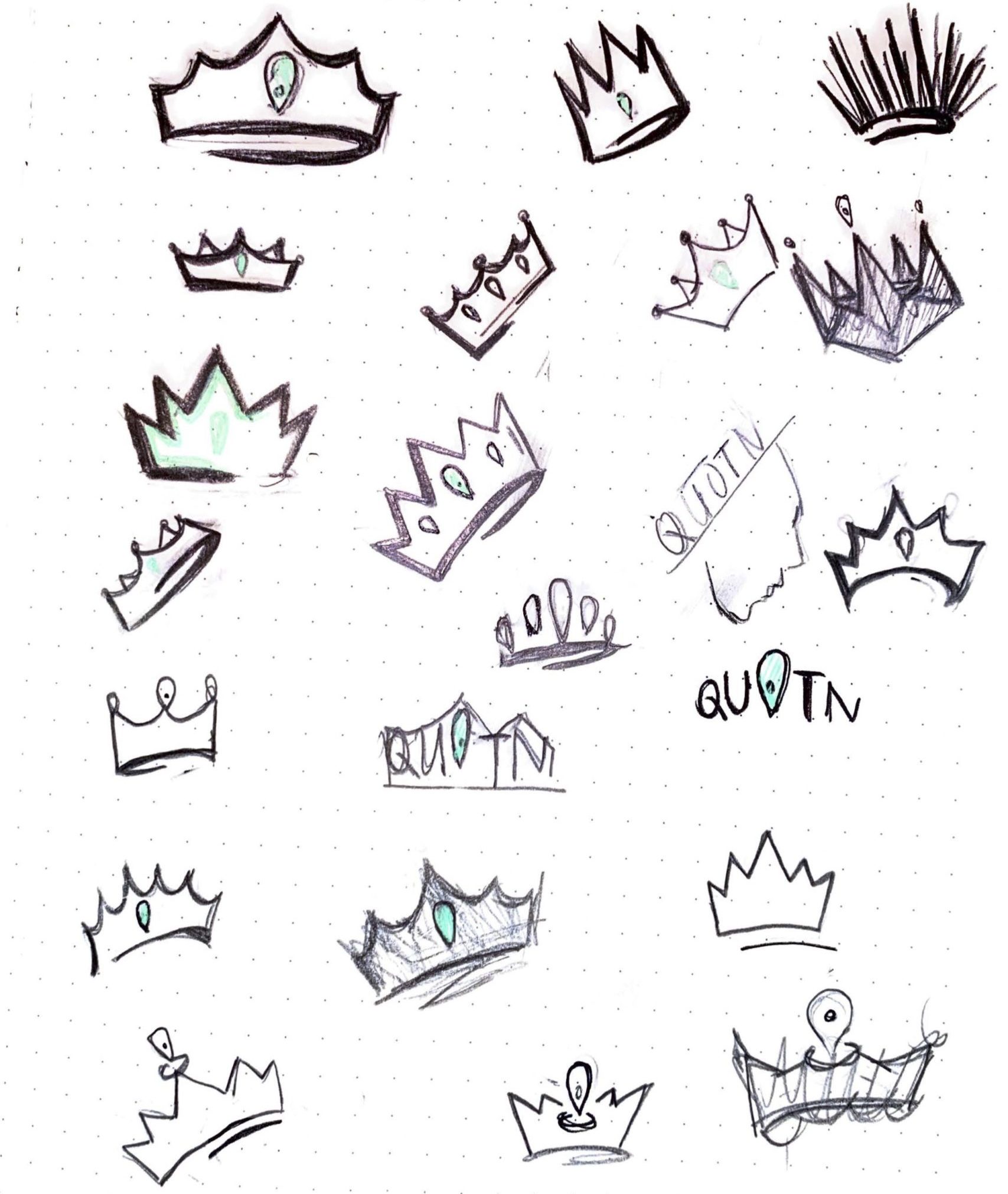
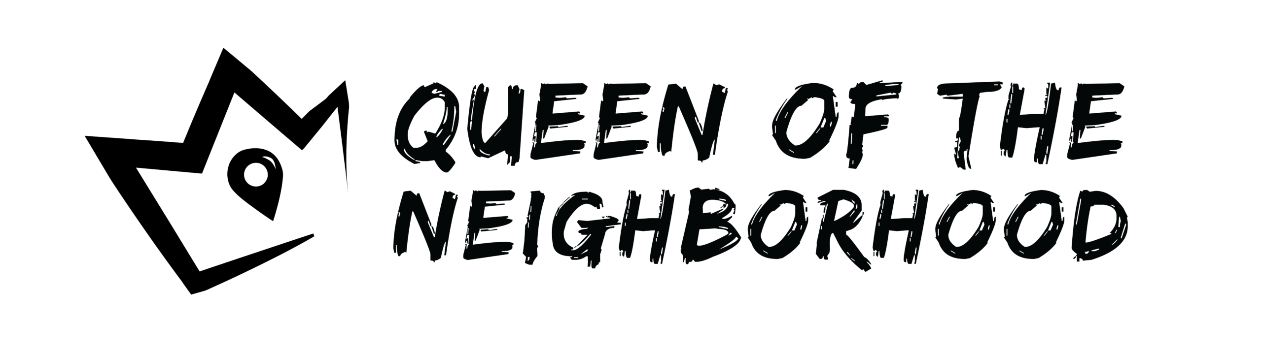
The original logo featured a literal queen’s face, which became unreadable at smaller sizes and didn’t fully represent QUOTN’s mission.
The design of original QUOTN logo is complex, and is hard to see the delicate details of the queen’s face when scaled down. The queen also doesn’t fully represent QUOTN’s mission.
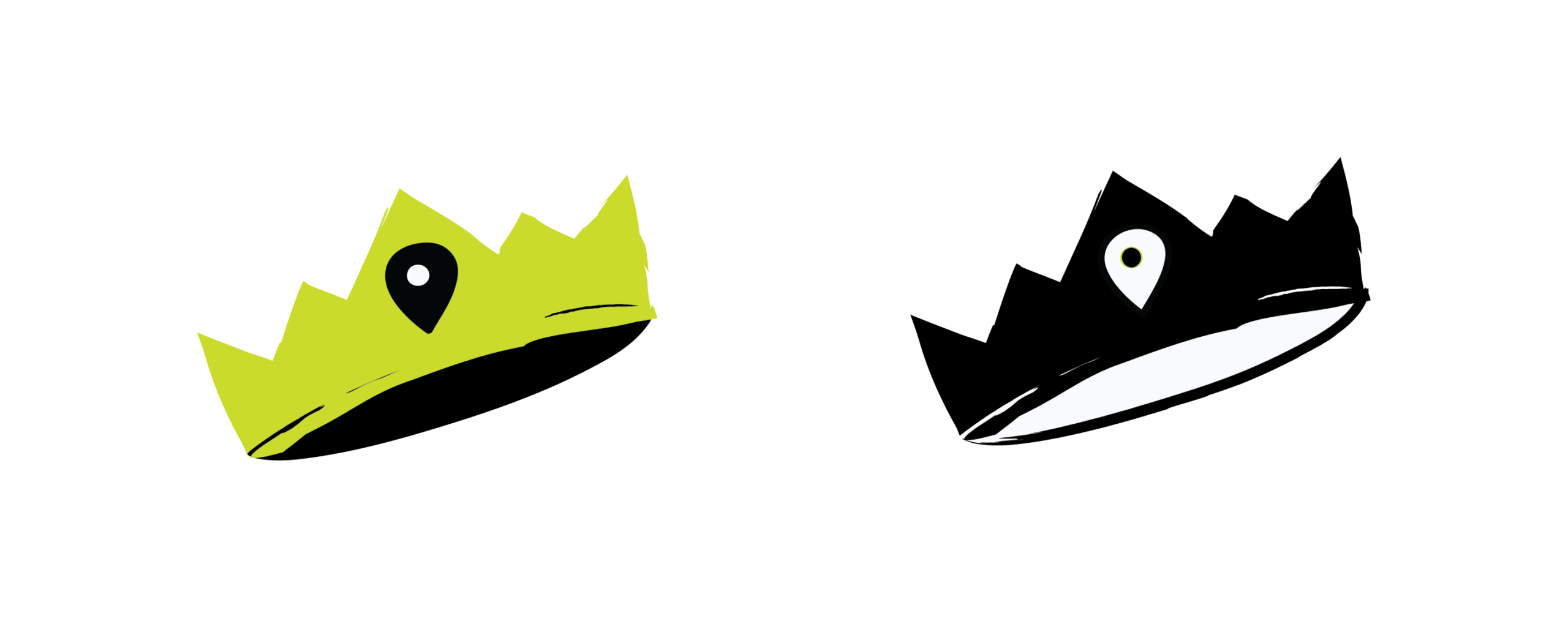
Solution: Instead of a literal 'queen' figure, I focused on simplifying to a crown and a location pin.
The design of original QUOTN logo is complex, and is hard to see the delicate details of the queen’s face when scaled down. The queen also doesn’t fully represent QUOTN’s mission.
Solution: Instead of a literal 'queen' figure, I focused on simplifying to a crown and a location pin.
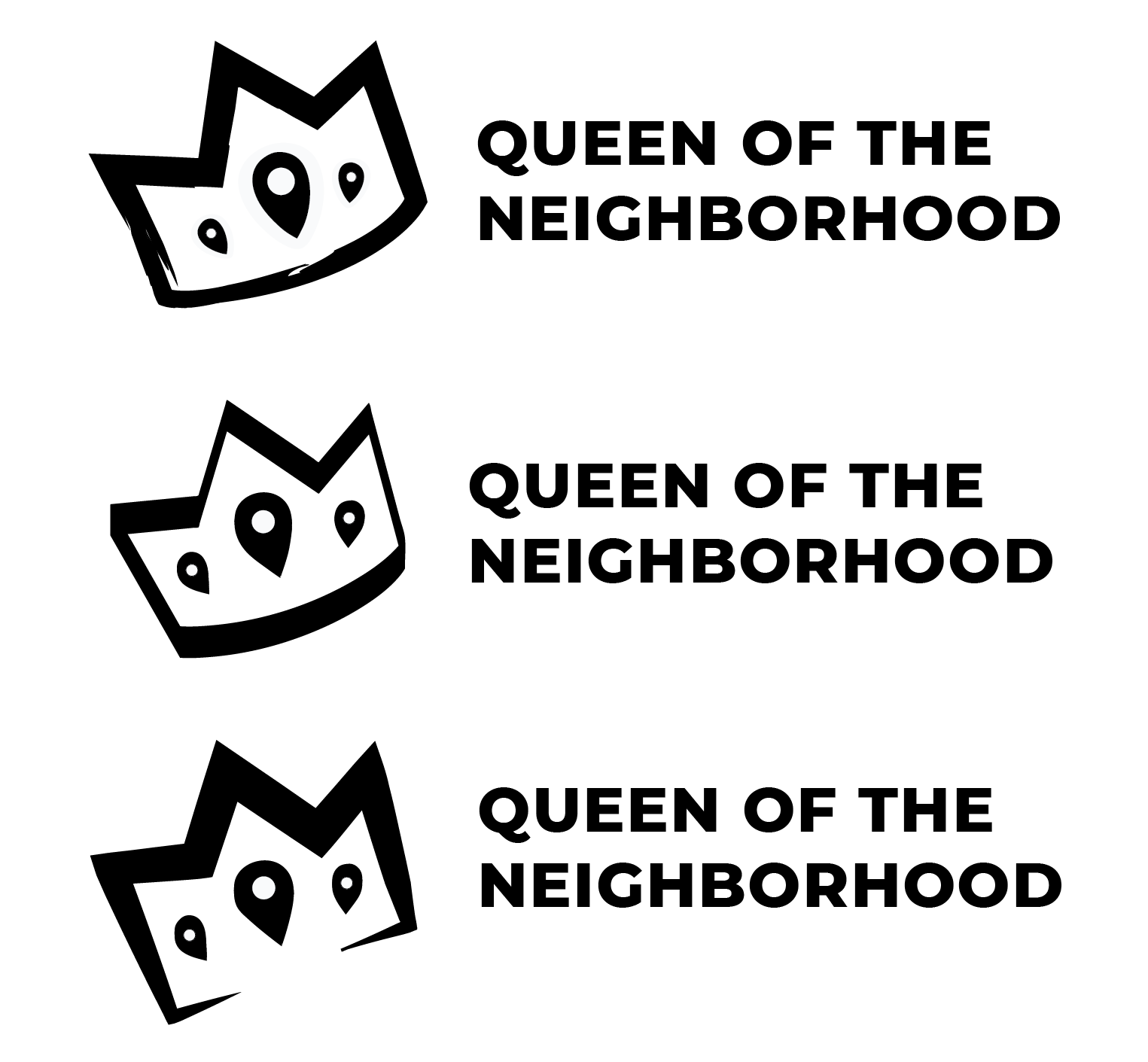
Explored hand-drawn crown and location-pin shapes to symbolize leadership and locality
The design of the original QUOTN logo is complex and is hard to see the delicate details of the queen’s face when scaled down. The queen also doesn’t fully represent QUOTN’s mission.
Solution: Instead of a literal 'queen' figure, I focused on simplifying it to a crown and a location pin.
Iterated multiple logo sketches to find a form that balanced femininity, rebellion, and simplicity.
The design of the original QUOTN logo is complex and is hard to see the delicate details of the queen’s face when scaled down. The queen also doesn’t fully represent QUOTN’s mission.
Solution: Instead of a literal 'queen' figure, I focused on simplifying to a crown and a location pin.
The design of the original QUOTN logo is complex and is hard to see the delicate details of the queen’s face when scaled down. The queen also doesn’t fully represent QUOTN’s mission.
Solution: Instead of a literal 'queen' figure, I focused on simplifying to a crown and a location pin.
Explored marker-style outlines to preserve the original DIY punk aesthetic while ensuring flexibility for digital use
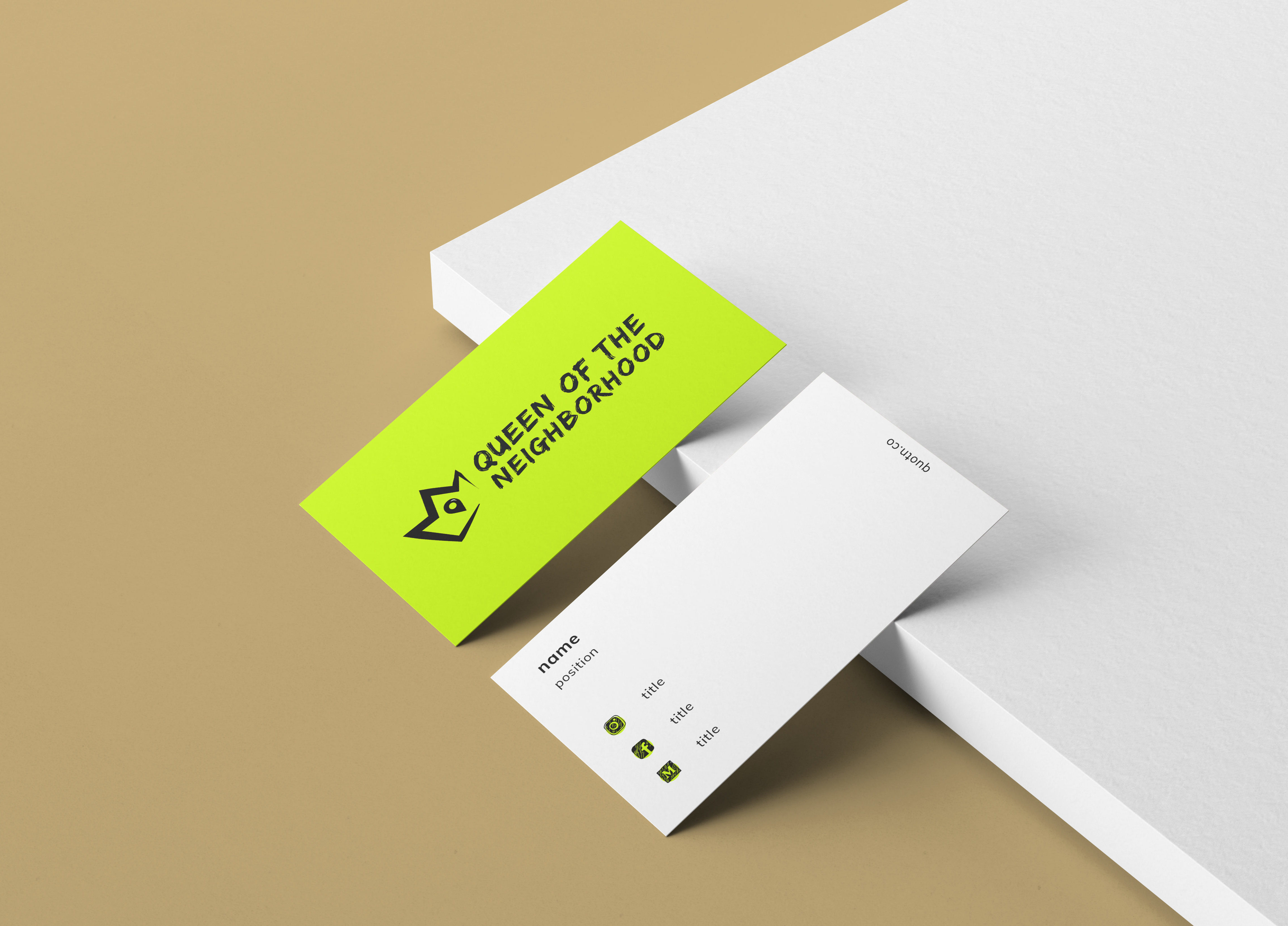
THE RESULT

The goal
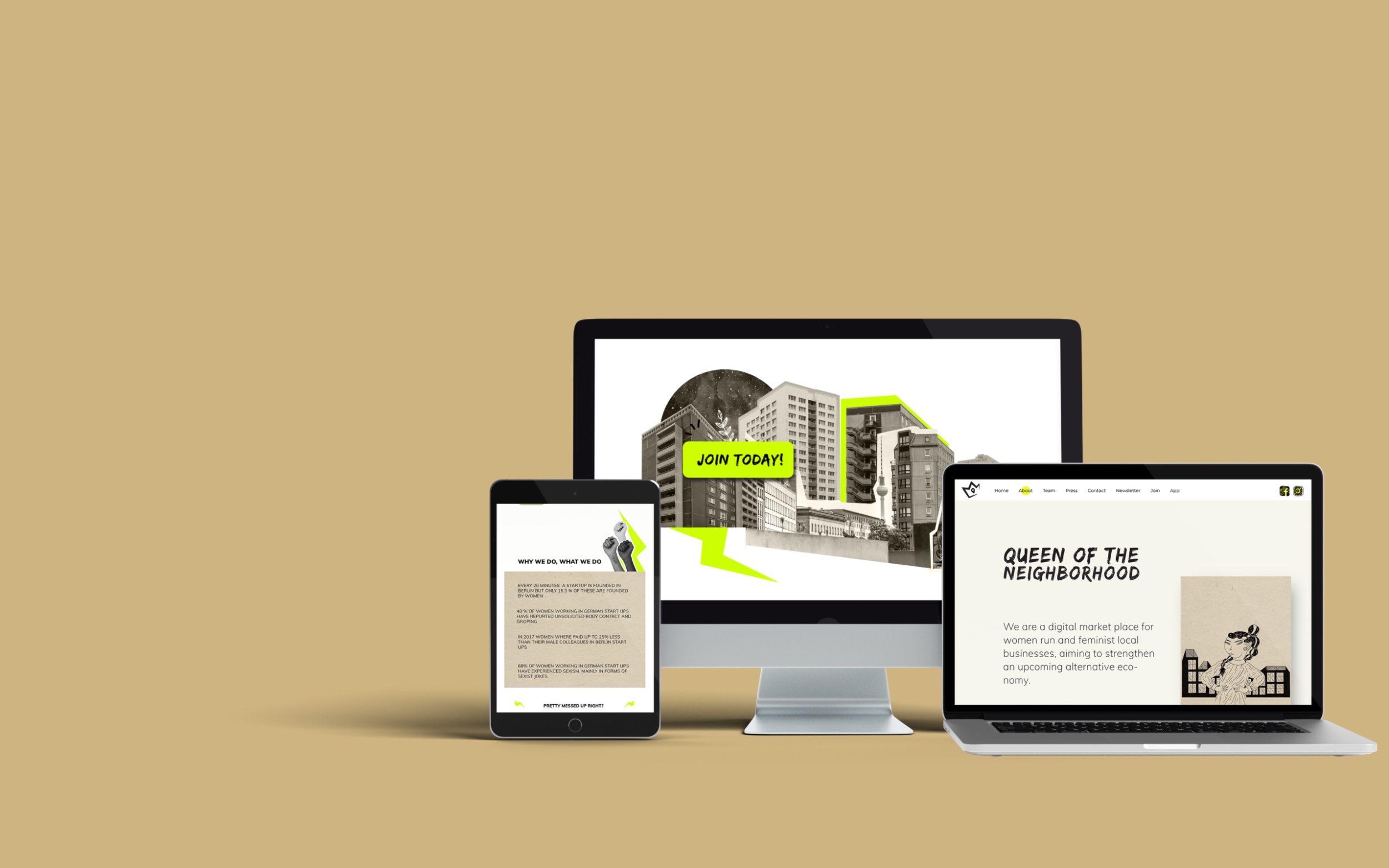
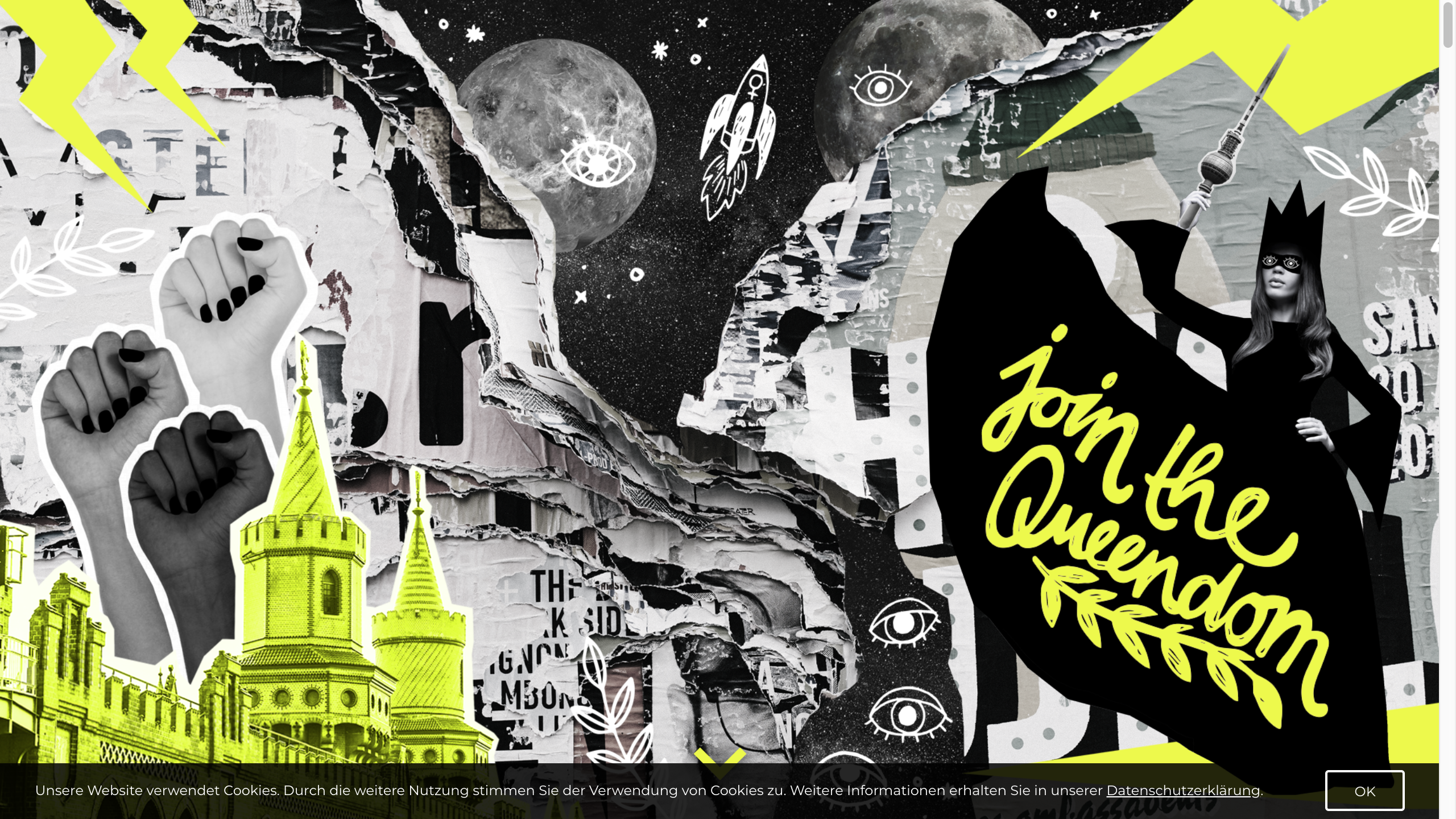
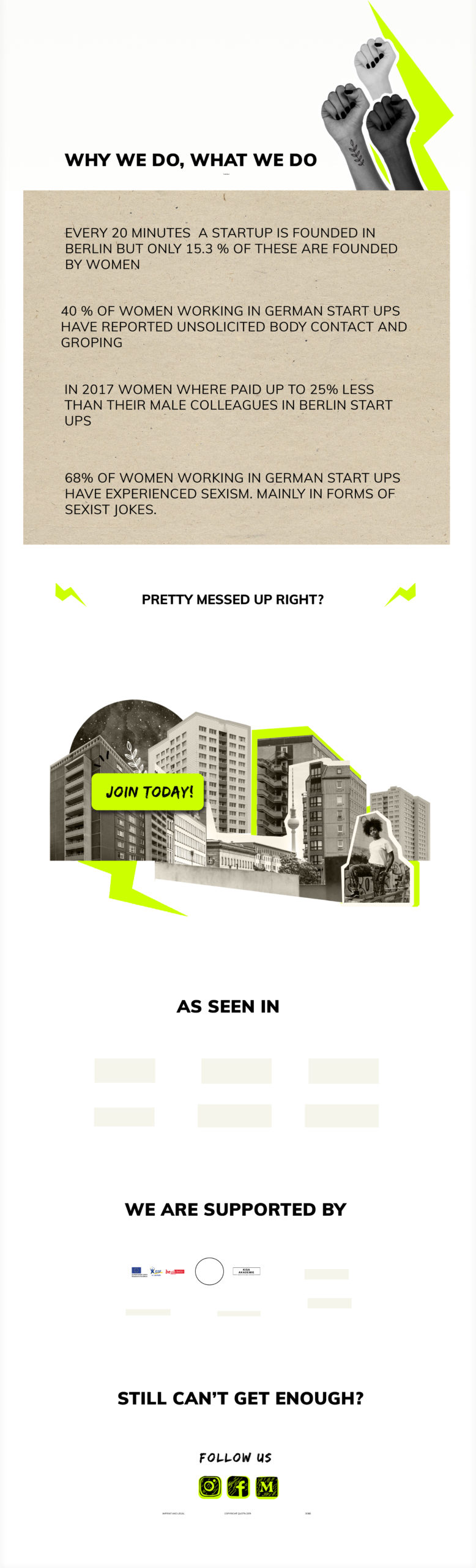
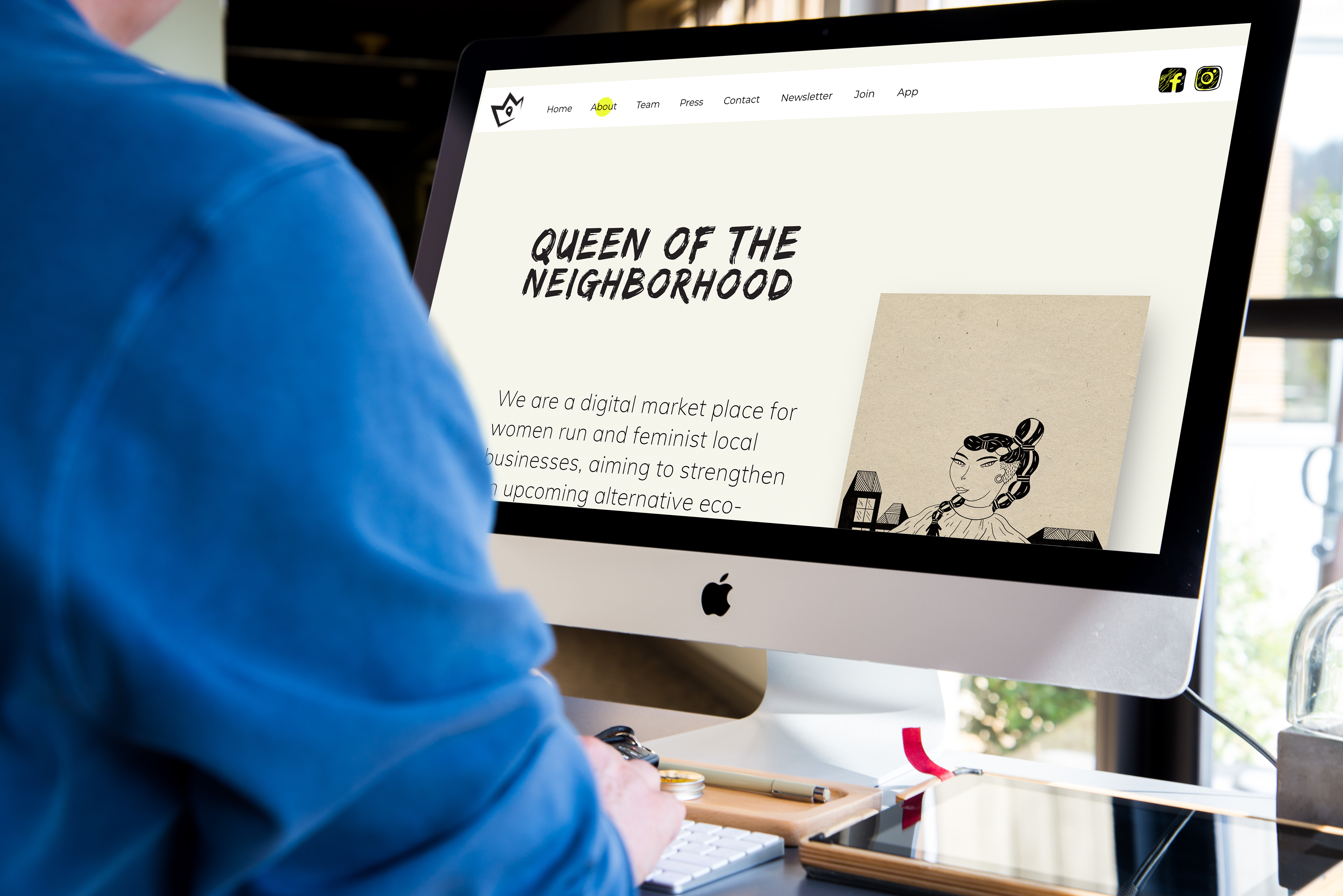
The old landing page was colorful and complex. The monochromatic collage, bright neon green, and graffiti font style were all inspired by "Riot Grrrl" - an underground feminist punk movement that began in the early 1990s.
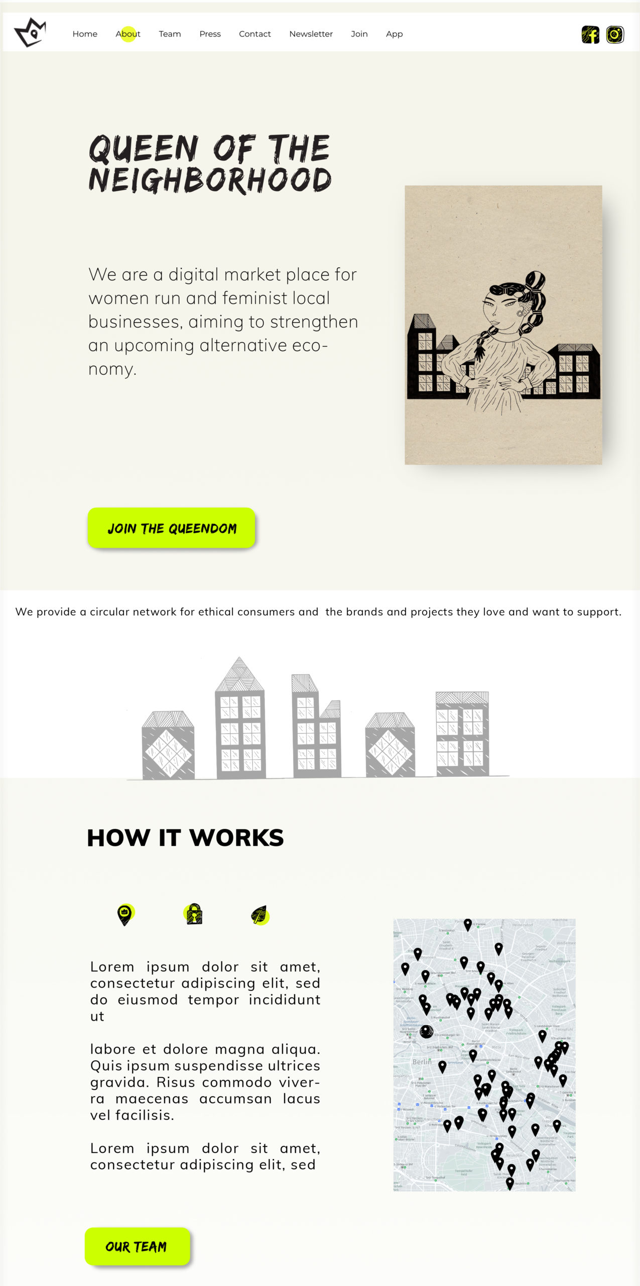
Similarly, QUOTN addresses all feminists, who want to support each other and create an alternative to the current economy, and decided that they need a fresh and clean look for the website design to attract a wider audience.
Branding and Visual Language
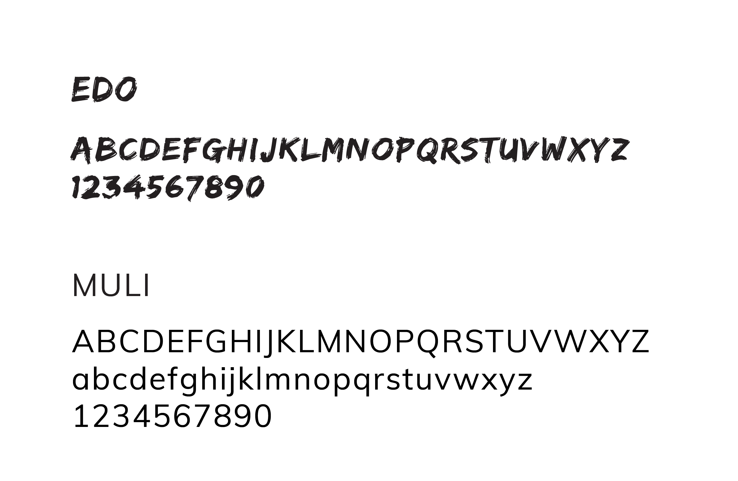
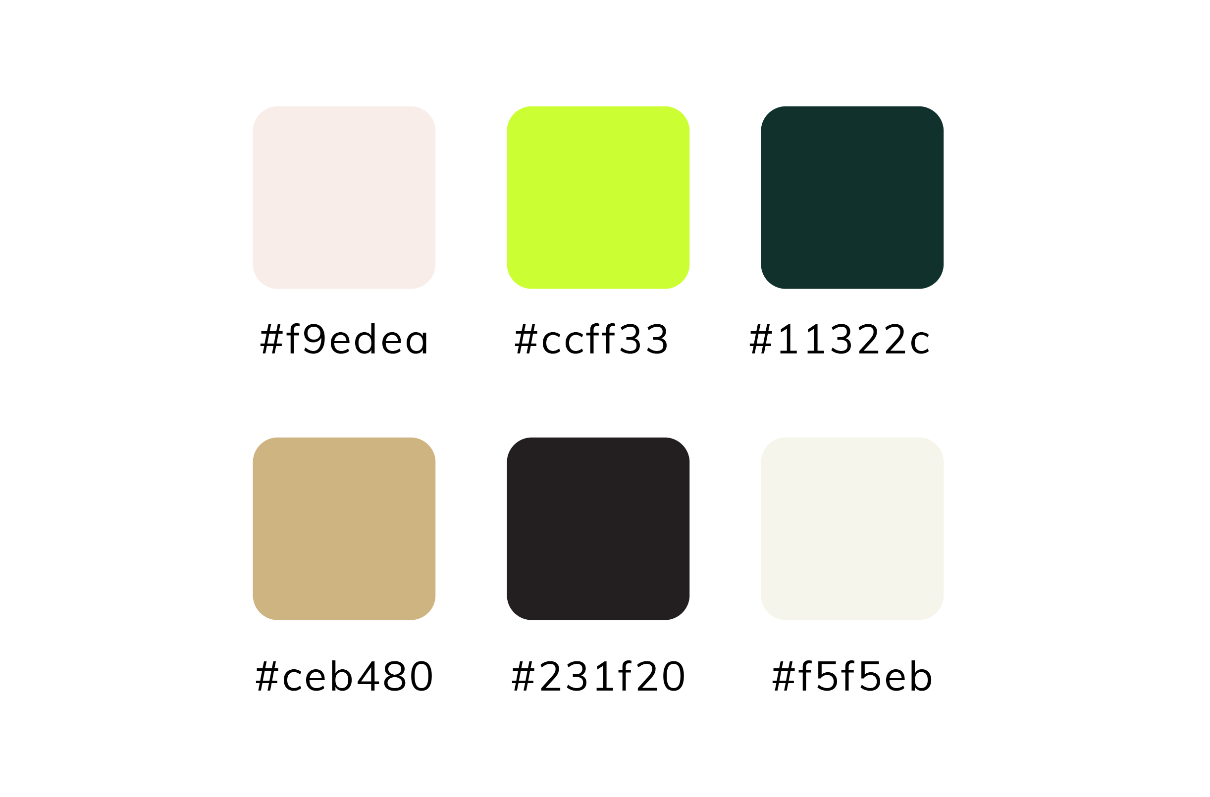
We retained QUOTN’s signature neon green to honor the Riot Grrrl spirit but paired it with a neutral palette and grainy, cardboard-inspired textures to emphasize sustainability.
Typography choices (EDO + Muli) blended edge and readability, helping create a clean, modern look that still carried the personality of the movement.
RESULTS
NEXT STEPS
QUOTN is recognized within their communities and spreading all across Berlin. They are currently taking new directions and have yet to implement them.

Thanks for stopping by,
Let's chat!